That's what I want to know. Of all the things that people were complaining about - I did not think colorization was one of them.
On a positive note - I think I finally found a color scheme for dialog editing that actually will work. Took me long enough but I think I can finally start client work in v7 now.
VP
VP, I get this.
My eye's are not so good these days and bright light gives me eye fatigue and having a useable UI is becoming more important as I get older.
Side note: please read with a sense of irony.
There are some regulations regarding accessibility and from what I understand it's a bigger issue to commerce than stuff we do, but there may be
some collateral issues that might have an indirect impact.
eg, companies selling to EU education or government sponsored companies.
I know that Ableton have introduced a screen reader into their environment, wonder why?
From what I have been reading, there are some EU regulations coming into force next year and a set of compliances for accessibility.
The thing that stood out for me was the sales to government or educational establishments... You know those educational Licenses.
My take... at the moment until the crap hits the fan and these compliances are in force, it's bit of a walk in the park as to how far reaching this might be?
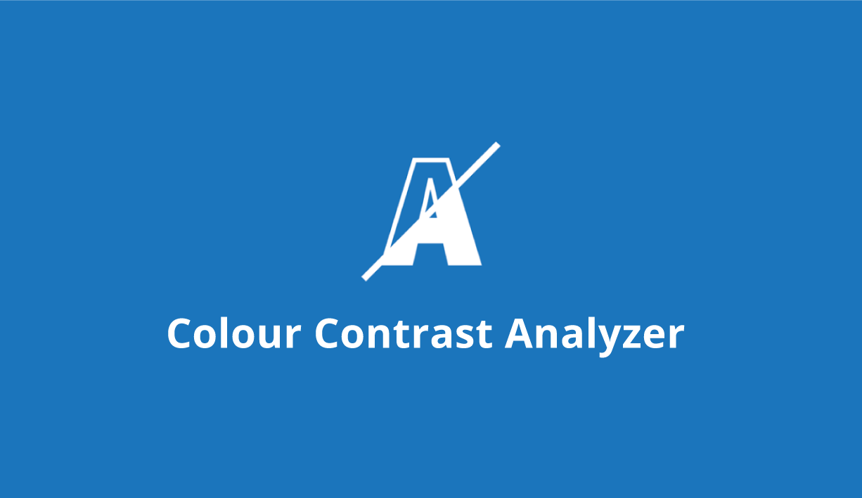
To be honest, I'm over-egging the situation, but you could prod Presonus and send them the links below to sort out the visualization and see what comes out of the wood pile.


The European Accessibility Act deadline is set; are you ready? Provide your team with the knowledge & tools to achieve EAA compliance goals.

www.tpgi.com
TPGi's ADA Color Contrast Checker helps determine the accessibility of the contrast ratio of two colors for WCAG AA and AAA.

developer.paciellogroup.com
Best regards


")