TonalDynamics
Active member
Hello friends, a little useful PSA here (hopefully) about getting the best possible text and UI clarity in Studio One...
As a user since version 1, I have only JUST solved this issue and man, Studio One looks INCREDIBLE now.
We all stare at our DAW for many many hours of many days, year in and year out... the text is cramped, small and cluttered, and it is crucial that you display it properly or your eyes will strain and you may get weird headaches over these long hours of unintentional self-abuse.
The following is what I changed to gain this aforementioned clarity in the entire GUI of the DAW:
(This is for Windows users, but I suspect MAC has something quite similar)
1. Ensure your monitor is in native resolution.
I used 1080p on my 1440p monitor for many years just to make the GUIs larger on my screens; THIS IS A BIG MISTAKE!
You are forcing your OS to UPSAMPLE the lower pixel-count image rendered by your GPU to span the GUI across your monitor.
In short, because this is not a 1-to-1 pixel map, but an ODD integer, the text and UI elements appear blurry and unrefined.
THIS is the primary cause of eyestrain on computers, NOT blue light!!!1
2. Right click in the desktop and go to Display Settings.
3. If you're like me changing the panel res. back to native made everything quite tiny. Use the 'Scale and Layout' options to increase the size of the UI. I use 150%, but both of my dual panels are quite large so I can get away with it. If you have smaller panels you may have to use 125% to fit enough of Studio One's UI on the screen.
These scaling integers retain a 1-to-1 pixel map for all graphical elements on the system, as they tell the entire OS to render all its objects and applications at a higher pixel count, rather than raster-upsampling the output of those apps, which is a destructive action and makes edges look blurry, soft, and hard to focus on.
4. Open Studio One briefly, go to Options>General>General, and ensure that 'Enable High DPI Mode' is checked, and shut the app back down.
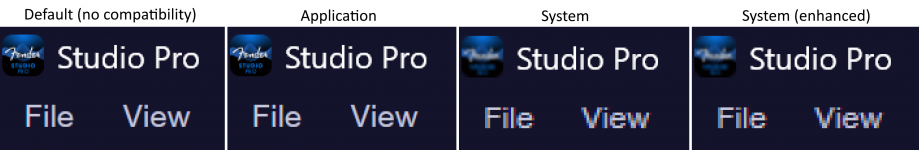
5 Here's the critical part: Find your Studio One executable. Mine is located @ C:\Program Files\Presonus\Studio One (version_x), yours will likely be under a 'Fender' folder if using the new version). Right click the .exe and click Properties>Compatibility>'Change High DPI Settings'.
At the bottom of this pane, check 'Override High DPI Scaling Behavior', and set 'Scaling performed by:' to 'Application'.
Critically, Studio One does not respond well to System-level scaling like some other apps do in its HiDPI mode.
Doing this finally enables Studio One to handle Windows' own scaling integer instructions internally, rendering its own text and UI elements with pixel-perfect accuracy.
6. Reopen Studio One and load up a Console-dense session.
Et Voila! If you're like me, you will notice an IMMEDIATE clarity to the entire DAW, both the console and arrangement, that you've never seen before.
7. BUT WAIT, THERE'S MORE!
OPTIONAL STEP:
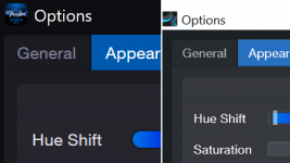
We can do even more to optimize visibility with the appearance sliders. The defaults are quite awful from my experience, leading people to dismiss the GUI precipitously. You can make your own profile, or try my own personal settings to give you a taste of what's possible that you can then finetune to your own displays:
EDIT: Doh! I can't upload a .colorscheme file here. Here is a screenshot of my visual scheme that you can manually copy (this increases the contrast and visibility of text against the entire UI):

(Note the clarity of the text in this interface as an example)
Try those on for size and adjust to taste for your own displays.
Curious to see the reactions to all these steps, perhaps I was just a buffoon and everyone already knew all this but I hope it helps you guys out.
Happy Mixing!
As a user since version 1, I have only JUST solved this issue and man, Studio One looks INCREDIBLE now.
We all stare at our DAW for many many hours of many days, year in and year out... the text is cramped, small and cluttered, and it is crucial that you display it properly or your eyes will strain and you may get weird headaches over these long hours of unintentional self-abuse.
The following is what I changed to gain this aforementioned clarity in the entire GUI of the DAW:
(This is for Windows users, but I suspect MAC has something quite similar)
1. Ensure your monitor is in native resolution.
I used 1080p on my 1440p monitor for many years just to make the GUIs larger on my screens; THIS IS A BIG MISTAKE!
You are forcing your OS to UPSAMPLE the lower pixel-count image rendered by your GPU to span the GUI across your monitor.
In short, because this is not a 1-to-1 pixel map, but an ODD integer, the text and UI elements appear blurry and unrefined.
THIS is the primary cause of eyestrain on computers, NOT blue light!!!1
2. Right click in the desktop and go to Display Settings.
3. If you're like me changing the panel res. back to native made everything quite tiny. Use the 'Scale and Layout' options to increase the size of the UI. I use 150%, but both of my dual panels are quite large so I can get away with it. If you have smaller panels you may have to use 125% to fit enough of Studio One's UI on the screen.
These scaling integers retain a 1-to-1 pixel map for all graphical elements on the system, as they tell the entire OS to render all its objects and applications at a higher pixel count, rather than raster-upsampling the output of those apps, which is a destructive action and makes edges look blurry, soft, and hard to focus on.
4. Open Studio One briefly, go to Options>General>General, and ensure that 'Enable High DPI Mode' is checked, and shut the app back down.
5 Here's the critical part: Find your Studio One executable. Mine is located @ C:\Program Files\Presonus\Studio One (version_x), yours will likely be under a 'Fender' folder if using the new version). Right click the .exe and click Properties>Compatibility>'Change High DPI Settings'.
At the bottom of this pane, check 'Override High DPI Scaling Behavior', and set 'Scaling performed by:' to 'Application'.
Critically, Studio One does not respond well to System-level scaling like some other apps do in its HiDPI mode.
Doing this finally enables Studio One to handle Windows' own scaling integer instructions internally, rendering its own text and UI elements with pixel-perfect accuracy.
6. Reopen Studio One and load up a Console-dense session.
Et Voila! If you're like me, you will notice an IMMEDIATE clarity to the entire DAW, both the console and arrangement, that you've never seen before.
7. BUT WAIT, THERE'S MORE!
OPTIONAL STEP:
We can do even more to optimize visibility with the appearance sliders. The defaults are quite awful from my experience, leading people to dismiss the GUI precipitously. You can make your own profile, or try my own personal settings to give you a taste of what's possible that you can then finetune to your own displays:
EDIT: Doh! I can't upload a .colorscheme file here. Here is a screenshot of my visual scheme that you can manually copy (this increases the contrast and visibility of text against the entire UI):
(Note the clarity of the text in this interface as an example)
Try those on for size and adjust to taste for your own displays.
Curious to see the reactions to all these steps, perhaps I was just a buffoon and everyone already knew all this but I hope it helps you guys out.
Happy Mixing!