• Hi and welcome to the Studio One User Forum!

    Please note that this is an independent, user-driven forum and is not endorsed by, affiliated with, or maintained by PreSonus. Learn more in the Welcome thread!

Fender Studio Pro 8 - Discussion Thread

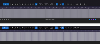
It's the ugliest looking DAW I have ever seen to date. It's like some washed out flat 2d atempt at Ableton. The difference is night and day under the same config file vs V6. I see we have the double border of dead space at the top back again. Split plugin folders for Fender and Presonus just to slap the Fender name on some of them them. The Fender ones reverted to a horrid grey colour of old that looks as pig ugly as the new GUI.

Luckily it's not hard to navigate to find the changes they made for what ever reason, I guess the work flow was an issue, zzzzzzzz. I don't care about brand name changes it was going to happen sooner or later but they need to stop changing and moving things around like the inspection panal icon and renaming functions or features because it's not upto Fenders liking or because every other DAW calls it that like freeze.

I will be honest. For the most part it's ok but I can't bare looking at it. It's looking more like a cheap kids phone app by the version and not a good looking one. Faders look ok so why didn't they apply the same effort to the rest. If anything the new look faders don't fit the rest of the GUI style at all. It's like a cartoon interface with nice faders stuck on it.

Mixed bag for me but I ain't going to be using something I don't enjoy the look of it's that simple. I can use Reaper FL Bitwig or Ableton if I want a pig ugly DAW to look at daily. It's ridiculous to be honest the amount of messing about with GUI changes and functions from V6 to now. Leave it alone already it's as confusing as an identity crisis :)
 
It looks mostly the same....yes, there are some subtle differences, but NOTHING at all like Ableton...that is the ugliest piece of software out there.
 
It looks mostly the same....yes, there are some subtle differences, but NOTHING at all like Ableton...that is the ugliest piece of software out there.
Agreed on the Ableton :) For me it's now got the flat look to it that seems to be about a lot like Acoustica Audio have been doing. I know some people will enjoy it but I don't. It looks way to way flat with very little definition vs V6, Icons look sunk into the GUI to the point it all has a flat look to it. It's to washed out and flat for my taste. It doesn't help the double top bar is back again adding a gaping space round the top of the icons. That's the same config file for V6 and V8.
 

Attachments

  • Screenshot 2026-01-14 180357.png
    Screenshot 2026-01-14 180357.png
    331,9 KB · Views: 33
By the way, they tried to copy the channel overview from Ableton, but something went wrong.
Because it's completely unusable. For example, with Fabfilter Pro Q, I can only see one filter in the channel overview, and for some reason it's a band 1. And I have five or more bands...
It's the same with other plugins... If there are more than six parameters, this window becomes useless.

It is impossible to select options in this window, and even the fonts are broken


Studio_Pro_E8wB9vsCfg.png
 
By the way, they tried to copy the channel overview from Ableton, but something went wrong.
Does Ableton make it better with 3rd party plugins? In YT videos I usually see only stock plugins.

And would this require additional code in the plugin?
 
He selects parameters using random numbers and arranges them in a random order.
This is just nonsense.
From the NDSP Nolly X, it didn't pick up a single amplifier knob, but for some reason it picked up the gate, prefx, and transpose)


Studio_Pro_x8ZYBGZiDp.png
 

Crossinger

If Fender Studio had given users the option to choose rack parameters themselves, it would have been logical. Now it's just completely useless nonsense.
 
@absu I don’t have v8 so I can’t check myself. But it looks like 8 parameters, and my assumption is: the first eight entries in the automation controllers list as reported by the plugin.

Edit: I’ve seen in a video that you can choose the shown parameters to your liking.
 

Crossinger

Yes, it looks like that), and I can’t think of any scenario for using this in real work) it`s broken by design )even with native s1 plugins )which have more than 8 parameters )

Even if the parameters were configurable, it would still be pointless, because instead of adjusting the knobs of each plugin and wasting time on it, wouldn't it be easier to open the interface of the same fabfilter and do everything as usual?
 
Last edited:
Who else is missing the circle of fifths from Studio One in the chord editor?
It was so easy to preview chords through different keys in the circle of fifths, I'm deeply missing that now!

Bildschirmfoto 2026-01-14 um 20.57.38.png
Bildschirmfoto 2026-01-14 um 21.01.08.png
 
Yes, it looks like that), and I can’t think of any scenario for using this in real work) it`s broken by design )even with native s1 plugins )which have more than 8 parameters )
That’s in the eye of the beholder. In the same way I don’t want ALL parameters in the plugin micro view, I also would focus on the most used parameters in the channel overview. What’s the point of cramming all parameters in a tiny panel? If you need full access, then open the plugin UI - simple as that.
 
By the way, they tried to copy the channel overview from Ableton, but something went wrong.
Because it's completely unusable. For example, with Fabfilter Pro Q, I can only see one filter in the channel overview, and for some reason it's a band 1. And I have five or more bands...
It's the same with other plugins... If there are more than six parameters, this window becomes useless.

It is impossible to select options in this window, and even the fonts are broken


View attachment 2686
Has anyone tried added a Splitter and seeing how it is represented in the Channel Overview
 
All this leads me to some bad thoughts.
I used to love S1 updates, because all the new features (even the ones I didn't really need) were thought through and tested.

Now it's a clear example of "we need new features, let's make something"—and no one even bothered to test how it would work.
 
in the plugin micro view, I also would focus on the most used parameters
The key flaw is that the most usable parameters aren't necessarily in the first 8 automation slots.
In many plugins, they're even organized alphabetically.
 
The key flaw is that the most usable parameters aren't necessarily in the first 8 automation slots.
In many plugins, they're even organized alphabetically.
See my edit above:
To view this content we will need your consent to set third party cookies.
For more detailed information, see our cookies page.

BTW: same is possible with micro view.
 
I found the parameter editing window, and it's made as unintuitive as possible and only works with 3D party plugins, ) Okay, then half the complaints are removed.
My mistake was that I tried to find this in native plugins, but there is no such option there.
 
That’s a bummer. :( I would expect this feature also for native plugins. (and yes: it’s way too technical and user unfriendly - especially when the plugin reports hundreds of parameters.)
 
This option appears and disappears in a strange way. For example, it's not in room verb, but it is in studio verb.
in both cases, native plug-ins
 
Last edited:
So there must be some kind of sharing at least once (right after installation).

"Sharing" is the wrong word. That implies one or more processes are going to the same well to drink

"Copy, parse and create" is more what goes on here. SP8's installer knows exactly where your prior version config data is - grabs it, massages it and injects it into your new install.

At the end of the install - you have a fully recreated "new" config - exclusive for SPv8's usage.

While the prior config remains untouched for continued v7 use.

VP
 
...

Incidentally, does anyone remember this little chestnut?


Back when Fender first acquired Presonus, we had the CEO yapping about stuff HE would like to see in Studio One and I quote:

"The simplest version of Studio One right now has a 150-page owner's manual, which I have said to the team is 149 pages too many,” he says. “Because you should be able to get out of the box, press one button and you're off to the races. So that's, again, a very easy brief, but very difficult to execute. But there has been a gravitational pull by aficionados to just keep jamming more and more features into DAWS when, in fact, I think you need to take away more features, make it simpler and more intuitive and less expensive." -Andrew P. Mooney, CEO Fender Musical Instruments inc., former chairman of Disney Consumer Products (DCP)

...

JB

Yes I remember that and I thought that meant 2 different products and I thought the Fender Studio mobile app was the embodiment of that declaration.

I thought Studio One was similar to ProTools in that it was a standard, professional tool. I did not think that they would touch Studio One and would just make a separate version with a lower learning curve for new markets.

I was wrong, lol.

I know apps have to change but I was hoping to enjoy v7 as it is for a while (with some improvements on it). I know I can just stay on v7 but there won't be any more updates.

I do see where Presonus can go after new markets using Studio One/Fender Studio Pro as an app for live sound (like Lava Studio but I can do everything, guitar, PA mix, etc in Studio One) I am using it live it is a great platform just missing a few things. Doesn't look like they are going that way either?
 
Back
Top